StudentStay
Scope
- Brand
- Logo
- Wireframes
- Front-end development
Overview
StudentStay is a platform for students that are subletting their place or searching for a sublet.
For 6 months, I worked on designing the brand identity and wireframes for a student-to-student subletting service, developing the website, and devising the product roadmap and requirements.
I led weekly sprint planning meetings, reporting back to the founders with the deployment timeline and MVP progress. I conducted user interviews and incorporated feedback before deployment.
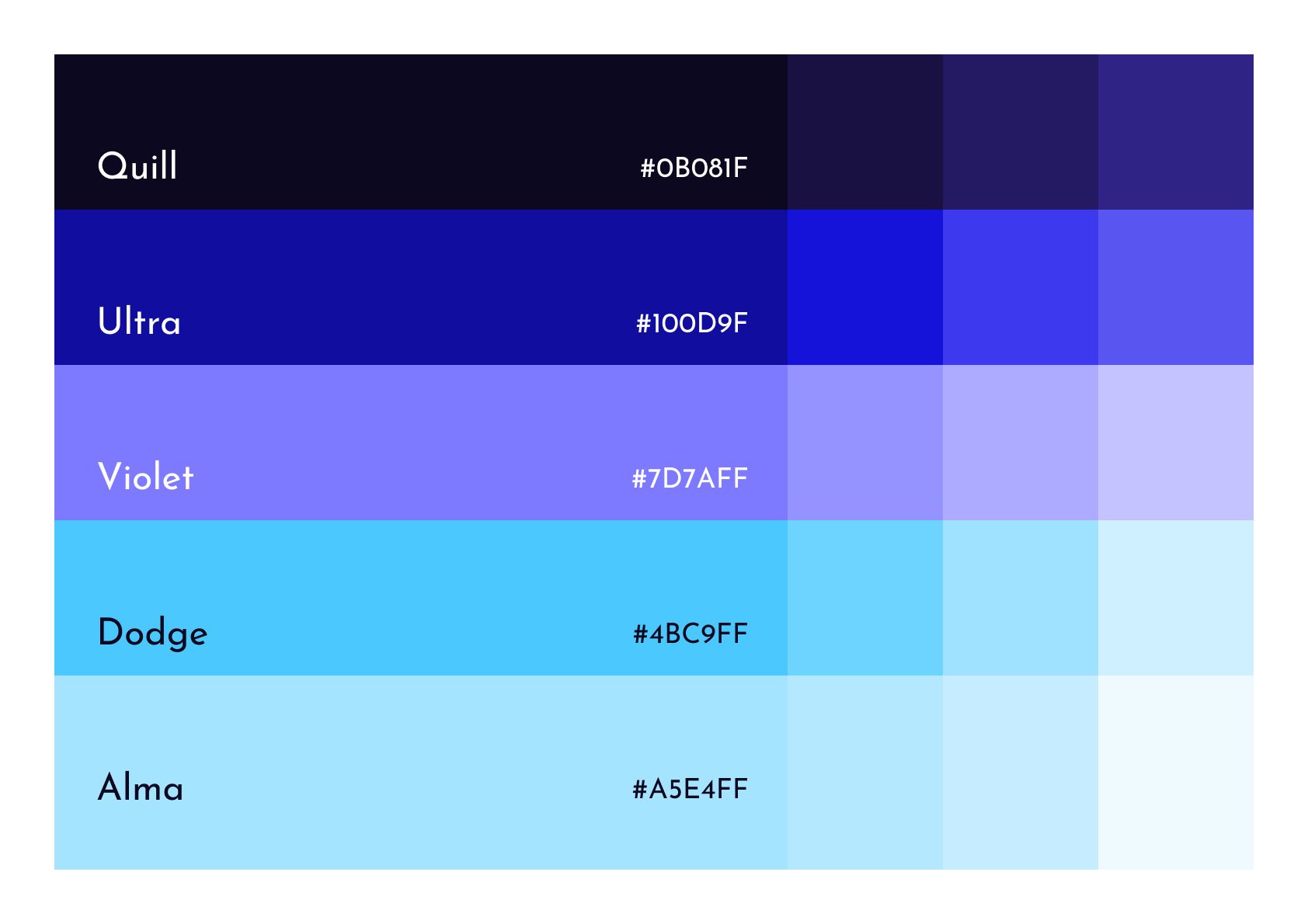
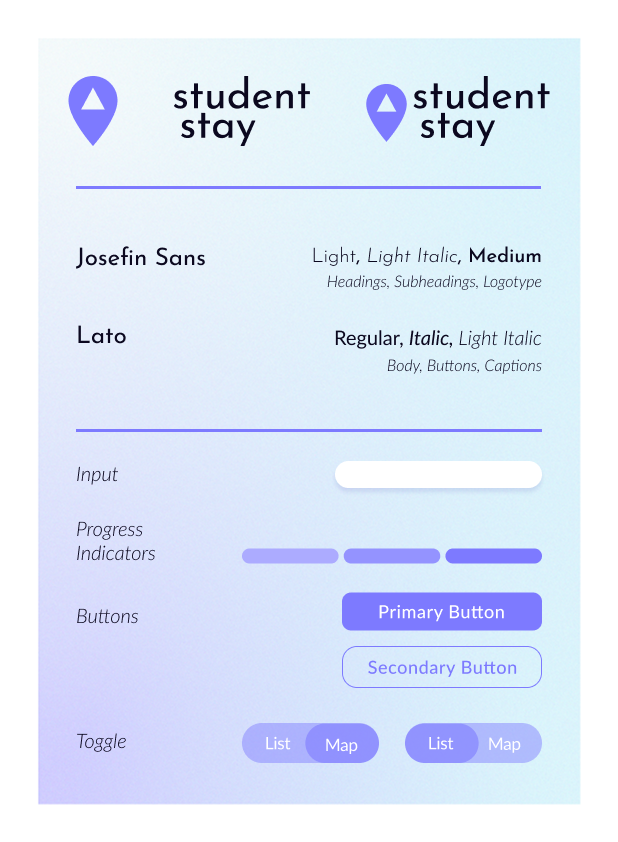
Colors
We wanted our colors to signify trust, so we kept it cool and minimal. I landed on deep purples for our primary palette and light blues for our secondary palette—a tie-in to our Columbia student identity— but we used them sparingly to be flexible for the brand's future growth.
Color application was more important to us than the colors themselves. We didn't want any single color to overpower the page, so gradients became a major asset in keeping the brand light and friendly—we used them exclusively for cards, and the rest of our components used the solid brand colors.
Logo
The logo was an important focus. We decided that the name was self-explanatory enough that we could use a simple, modern logo. We wanted to center the triangle, an abstract representation of a house and the connected nodes of a network. But this was a bit too abstract (and thus not very memorable or trustworthy), so I added the location pin to give the isolated logomark a little more context.
For the logotype, we went with Josefin Sans, a geometric sans-serif that plays
well with the angles of the logomark. We thought this gave the overall
logo a great ratio of angularity to friendliness.
![]()
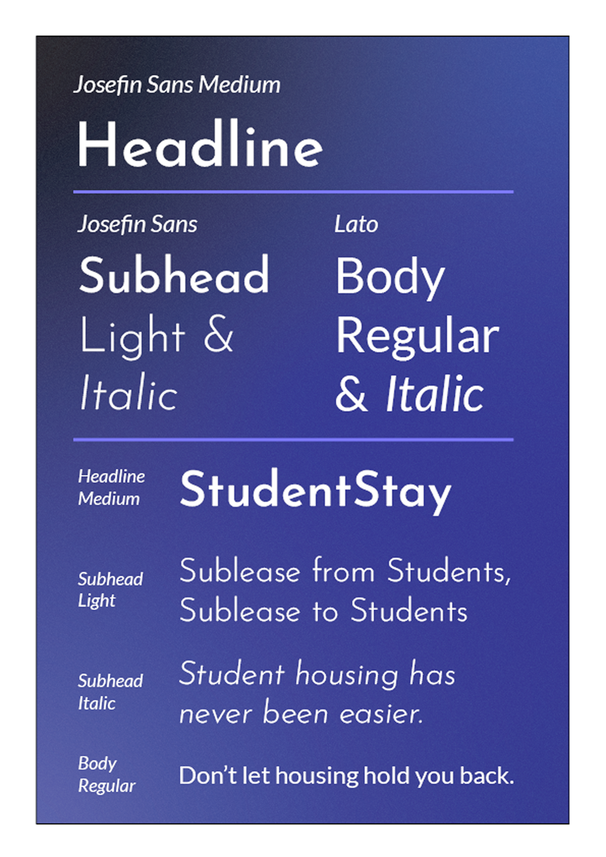
Typography
We thought the logotype on its own worked well, so we kept it simple and
used Josefin Sans for our headings and subheadings, too.
For the body text and any secondary elements, we went with Lato,
a highly readable sans-serif with a roundness to its terminals.
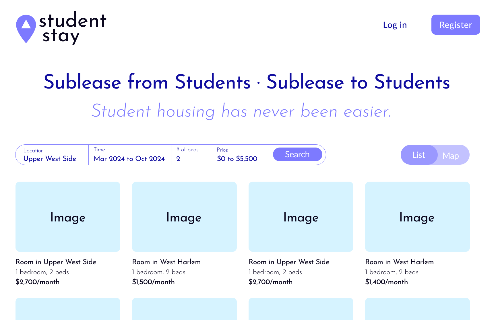
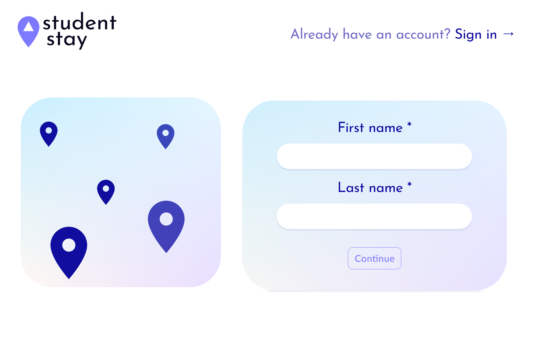
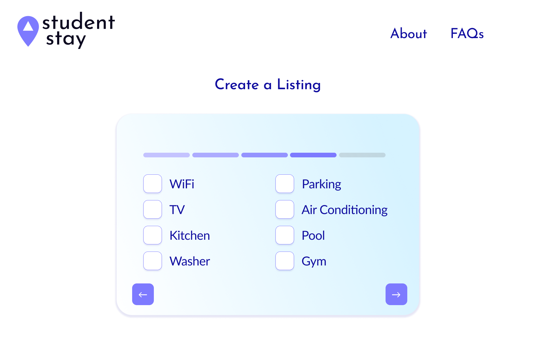
UI and Wireframes
After defining the logo, colors, and typography, I moved over to working on
the UI. I worked on the wireframes while simultaneously
defining the project requirements and timeline. After defining
the major pages and features, we started to see how form-heavy the site would be.
We knew we'd struggle to keep the user engaged while going through the multi-step forms, so we tried to simplify the process as much as possible and kept the cards small to keep the user from feeling overwhelmed. We took a similar approach to the search results page.
This was a work in progress - we were constantly iterating on the wireframes to find the best visual balance.
Here's a small sampling of the wireframes.